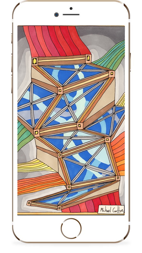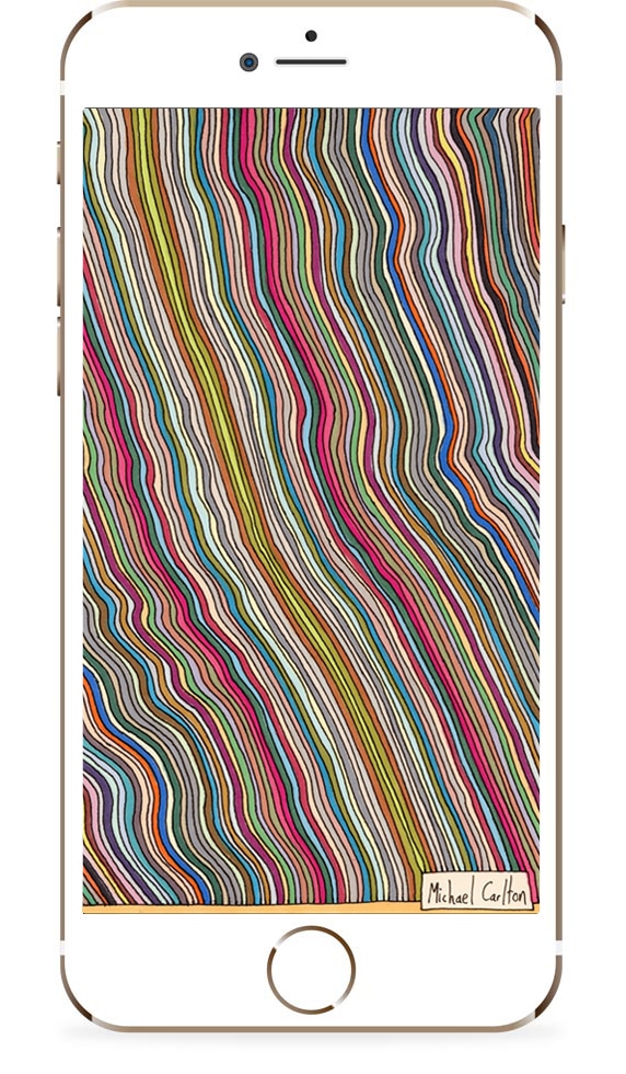
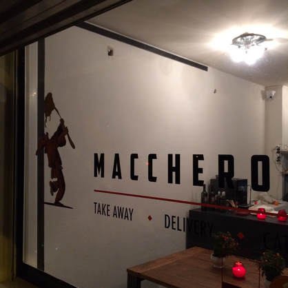
Mural at Maccheroni Restaurant -
Phase 3: Composition and First Few Shapes
Phase 3: Composition and First Few Shapes
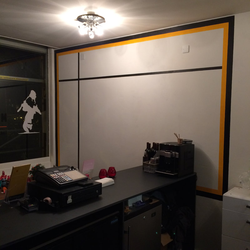
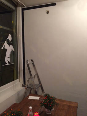
Now that the border is in place I can start working on the overall composition of the piece and adding the first few colours.
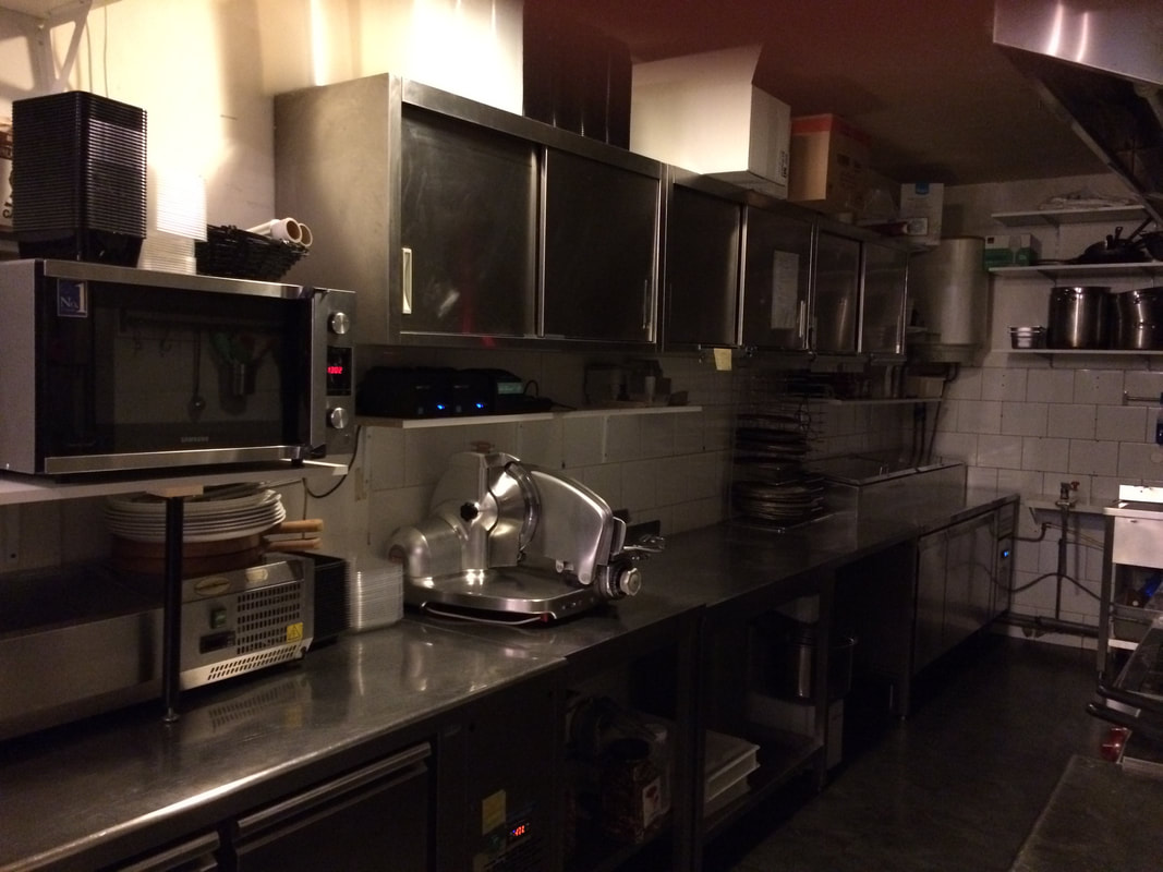
The restaurant itself has quite a lot of square and rectangular shapes in it from all the ovens, cupboards, display screens and pizza boxes so I want to create something along those lines to complement these shapes.
The restaurant itself has quite a lot of square and rectangular shapes in it from all the ovens, cupboards, display screens and pizza boxes so I want to create something along those lines to complement these shapes.
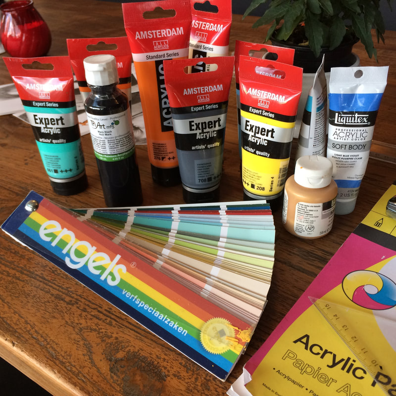
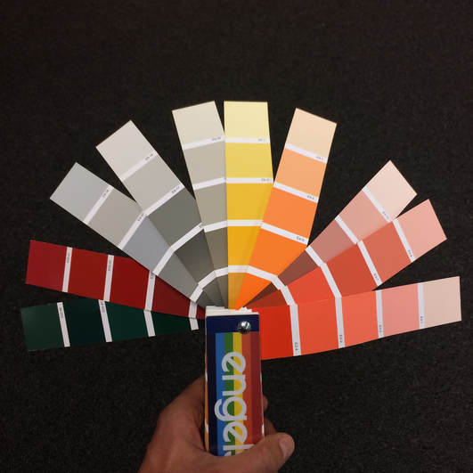
The kitchen area has a lot of metallic colours and greys so colour scheme-wise I want to include some of those colours in the painting:
 |  |
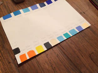
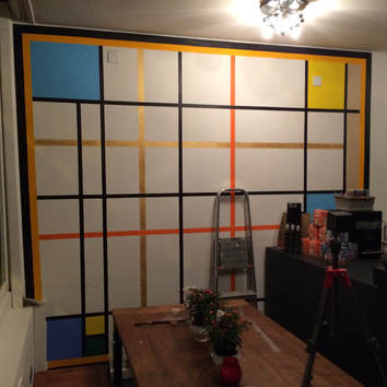
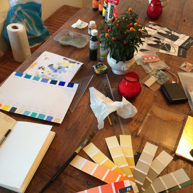
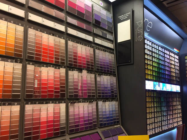
I'm going to be using a colours scheme based around the orange and back of the restaurant logo, along with some sandal colours to complement the brown furniture in the restaurant, and some bright blues and yellows to offset the darker greys and metallic colours of the kitchen area:
 | |
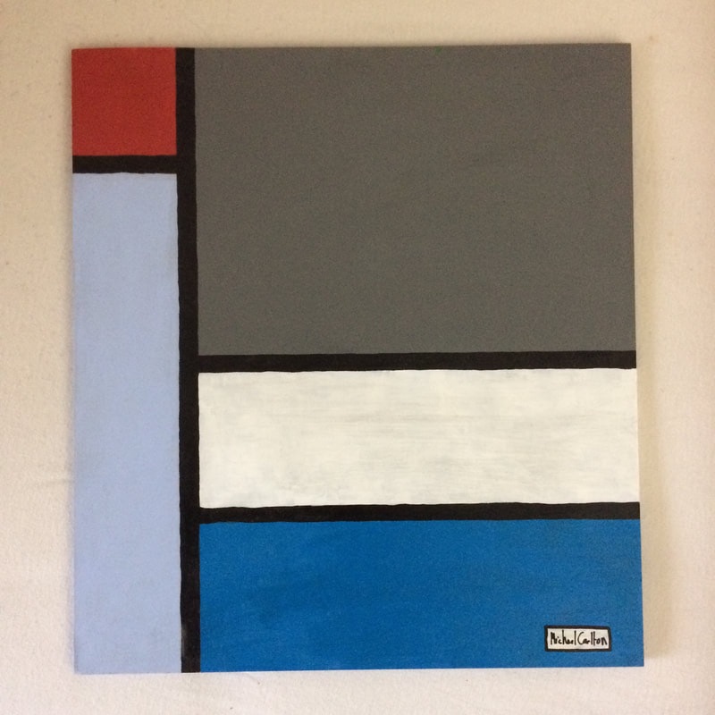
Being in Amsterdam I want to create something that looks quite Dutch whilst at the at same time having a bold Italian look and feel.
To do this I'm going to create a Piet Mondrian-esque painting with a bright and bold colour scheme:
To do this I'm going to create a Piet Mondrian-esque painting with a bright and bold colour scheme:
 |  |
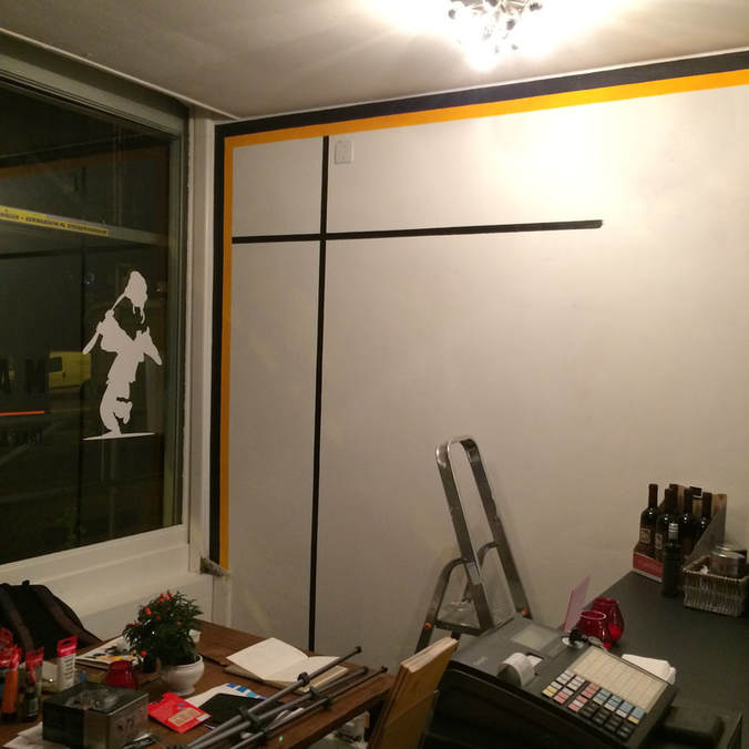
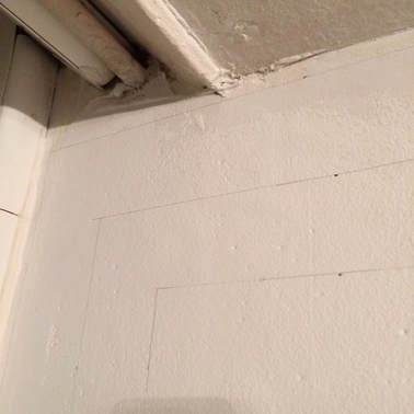
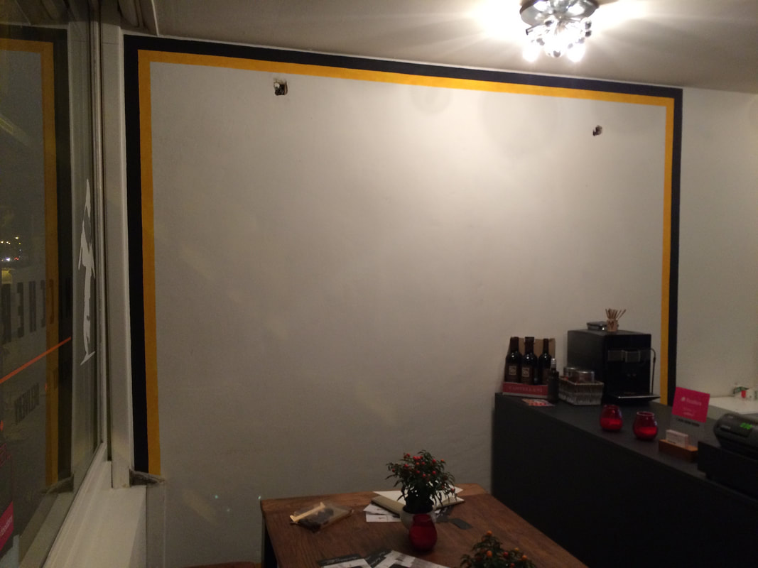
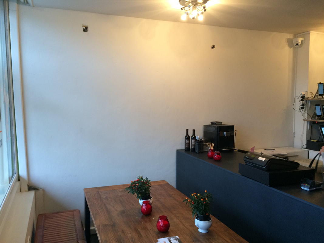
Before I start the painting I need to get a couple of reference lines around which I can build the remaining composition of the painting.
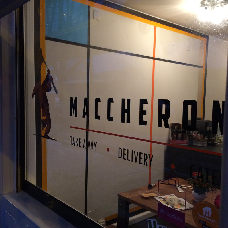
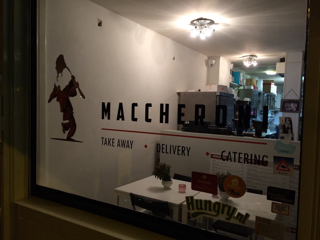
The reference lines will be based around the logo and lettering on the front window:
The reference lines will be based around the logo and lettering on the front window:
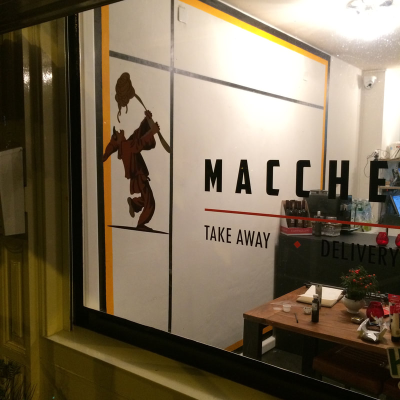 |  |
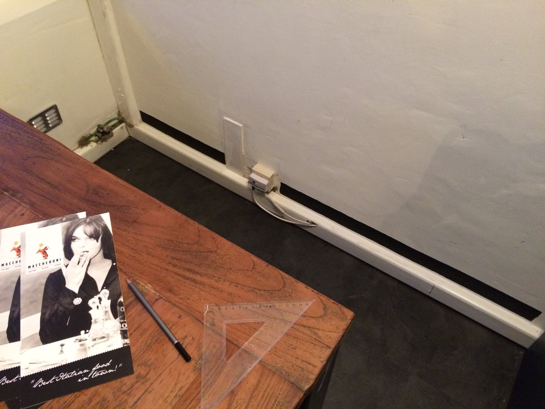
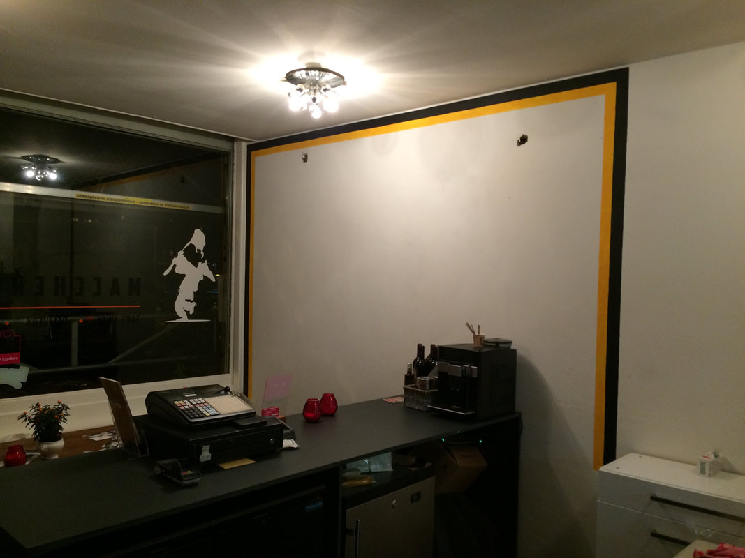
The 2 black lines frame the logo figure when viewed from outside an also create a compositional space around the counter from the inside.
This creates a dual-viewing effect where the painting looks and feels slightly different when viewed from one angle and position on the inside and another from the outside.
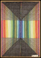
Now I just need to paint the first few colours the starting point for the rest of the colour scheme:
This creates a dual-viewing effect where the painting looks and feels slightly different when viewed from one angle and position on the inside and another from the outside.
Now I just need to paint the first few colours the starting point for the rest of the colour scheme:
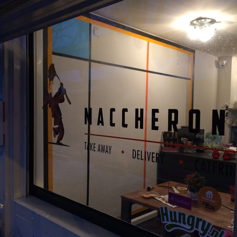 |  |
The first and most important initial colour is the orange stripe that passes down the middle area of the painting.
Like the black lines before this orange line links the window logo into the composition of the painting and frames the counter against the edge of the painting.
The orange stripe intersects the orange line of the logo at a 90 degree angle when viewed from outside and sets the painting up for the perpendicular shapes that will follow.
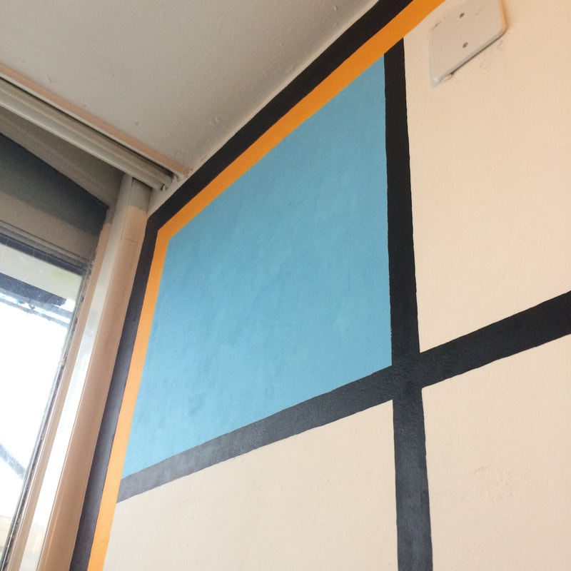 | 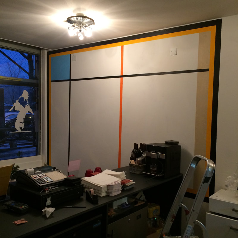 |
The other 2 colours to set up the initial colour scheme of the painting are a sky-blue in the top left corner of the painting to suggest "outside" and a light pastel brown pillar-shaped colour on the right of the painting (which matches the furniture colour scheme) to suggest "inside".
The orange stripe down the middle is prominent when looking in from outside so within the abstract context of the painting it suggests both "inside" and "outside" and acts as a pivital point between in and out, left and right etc.
The orange stripe down the middle is prominent when looking in from outside so within the abstract context of the painting it suggests both "inside" and "outside" and acts as a pivital point between in and out, left and right etc.
 | 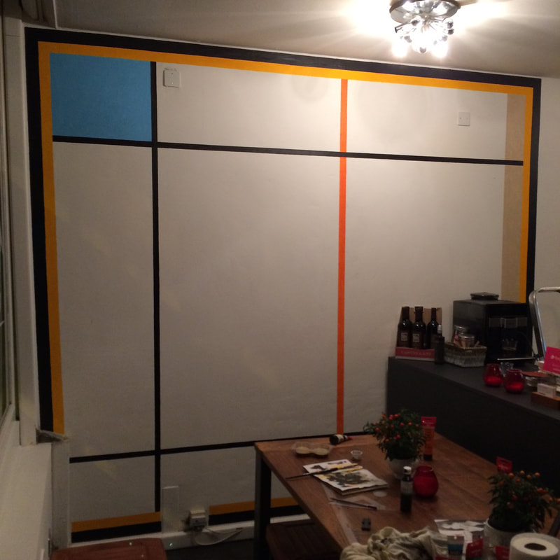 |
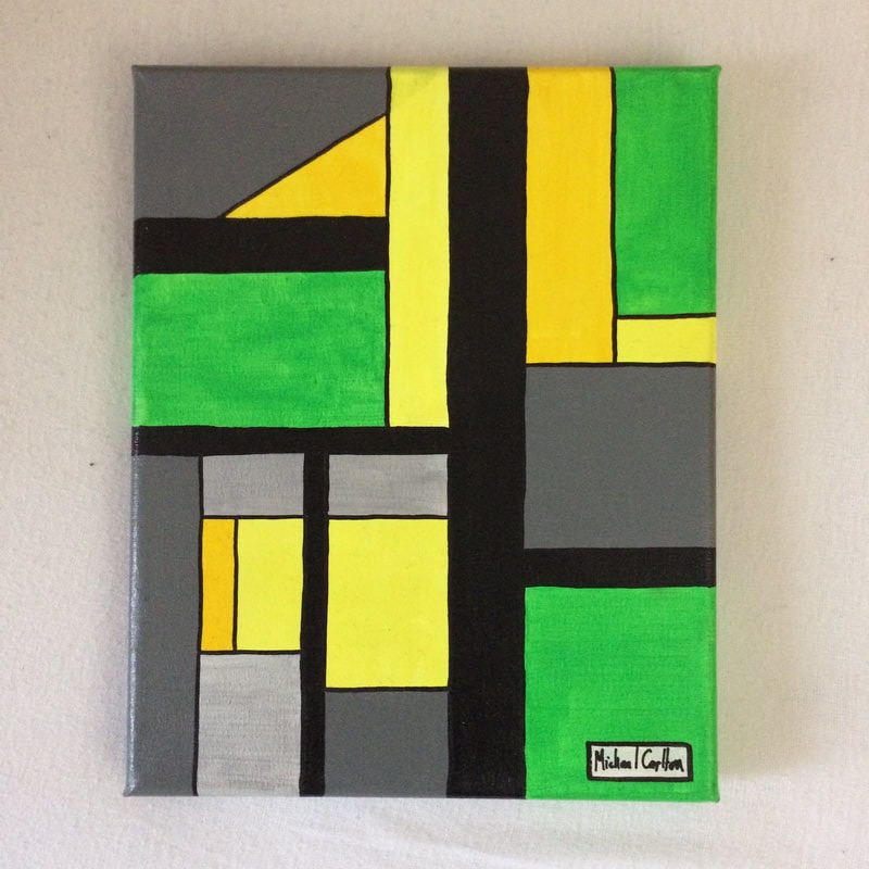
Now that the foundation of the painting is complete I can now start adding more colours and shapes knowing that they will all fit in and work well with the surrounding environment of the painting.
Next Post - Phase 4: Adding the Colours
Latest News

To keep-up-to-date with the latest projects and exhibitions subscribe to the
Michael Carlton Art Newsletter
Michael Carlton Art Newsletter


 RSS Feed