Maccheroni Art
Painting Design Modifications - 10th Dec 2017
Hi Marleen,
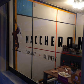
As I mentioned in the email I was a bit concerned that the style of painting from the flyer would interfere with the visibility of the lettering and logo on the window and might potentially confuse passers-by as to the nature of the business.
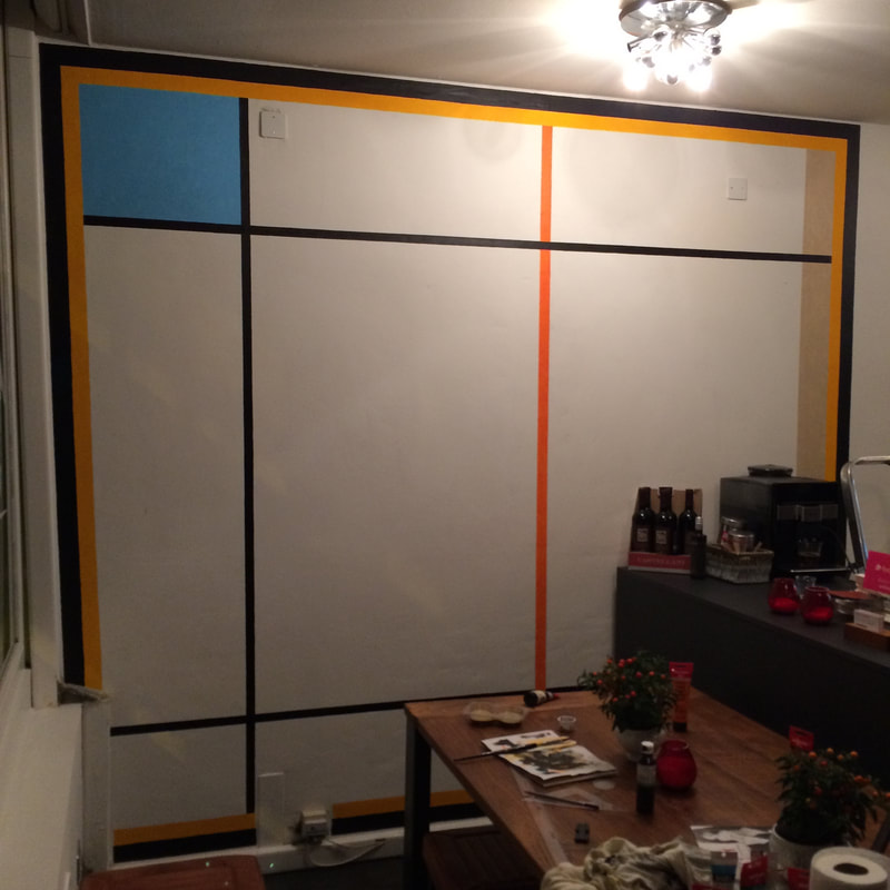
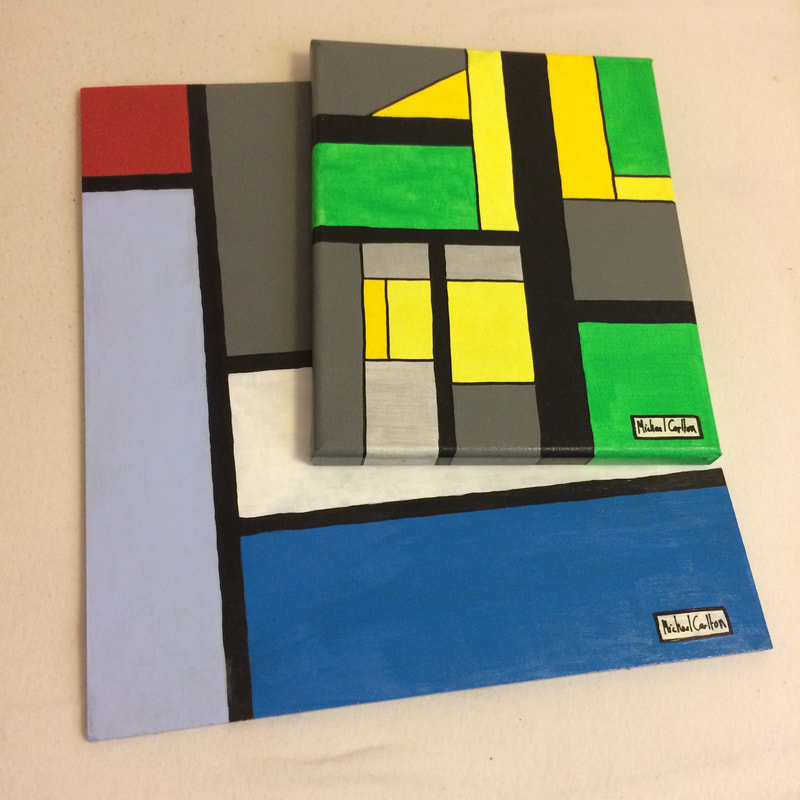
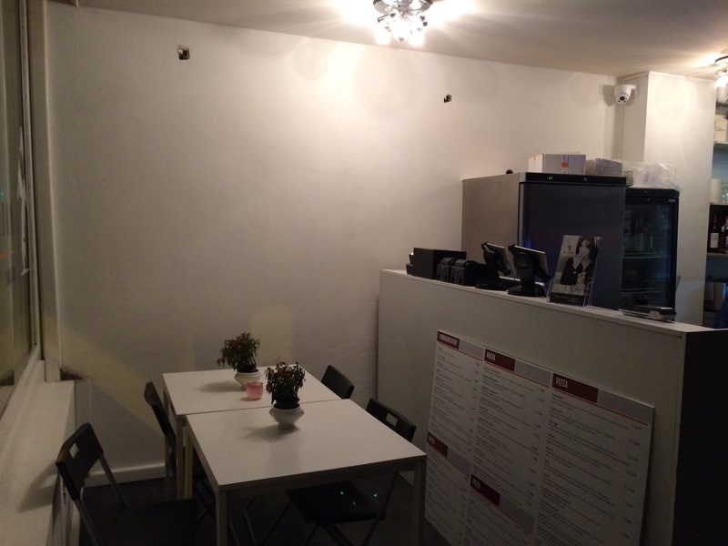
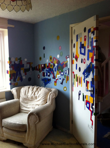
As such I would suggest a more "Mondrian-esque" style of painting (as below-right but with different colours) which would complement both the lettering and the logo, would look like "restaurant art", and would also catch the attention of passers-by:
From inside this style will also make the counter look like it's emerging from the painting and will create a more immersive look within the restaurant.
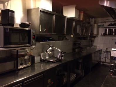
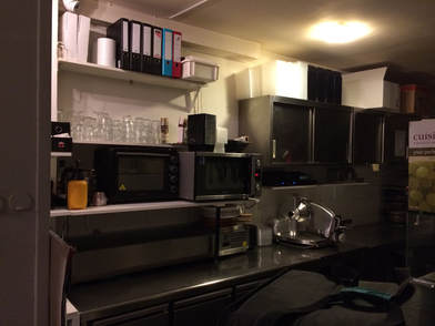
The restaurant also has a lot of square-shaped dark grey/metallic appliances and equipment towards the back (ovens, microwaves, tablets, cupboards etc.) so to have similar sorts of shapes only in colour towards the front of the restaurant would be very effective:
The restaurant also has a lot of square-shaped dark grey/metallic appliances and equipment towards the back (ovens, microwaves, tablets, cupboards etc.) so to have similar sorts of shapes only in colour towards the front of the restaurant would be very effective:
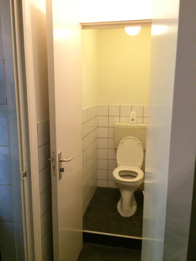
Toilet Doors:
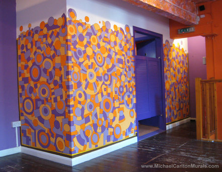
This style of painting would also lead on well to something similar around the toilet door area if you decided to go ahead with that next year.
This style of painting would also lead on well to something similar around the toilet door area if you decided to go ahead with that next year.
Colour-Scheme Adjustment:
I've also made some slight adjustments to the colour scheme, I don't think you'll have any objection, but just want to make doubly sure before I commit it to the wall.
For the colour-scheme I'm looking to work the palette around the black and orange of the logo, add in some very dark green and grey/black to go with the counter and the door, and off-set these heavier colours with some lighter blues and yellows, add in some sandal colours to complement the furniture, and should also be able to get some metallic gold in there too as requested.
Hope you're OK with those adjustments - if so let me know then I can start moving towards the next phase of the painting.
Best wishes,
Michael
Possible Painting Styles - 1oth Nov 2017
Hi Marleen,
Please find below some photos and videos of some existing pieces in styles that can be adapted to fit your premises:
Please find below some photos and videos of some existing pieces in styles that can be adapted to fit your premises:
Mural for the Main Wall (by service counter)
Toilet Doors and Toilet Area
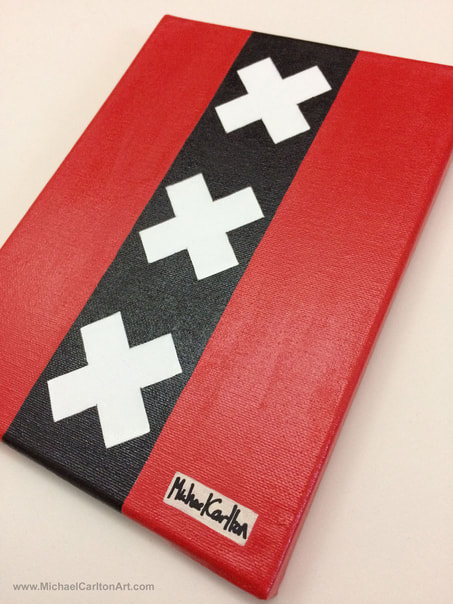
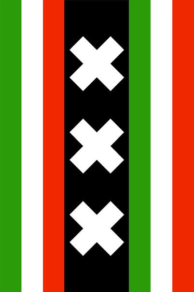
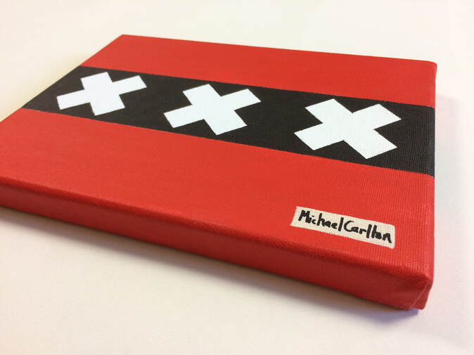
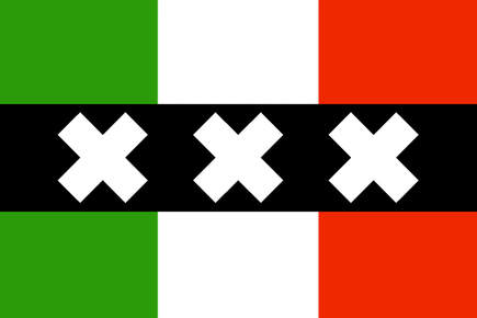
Amsterdam Flag/Italian Flag Design
I don't know if you saw it on my website but I also do Amsterdam Flag paintings combined with national flag colours that you might be interested in featuring somewhere in the overall design too:

